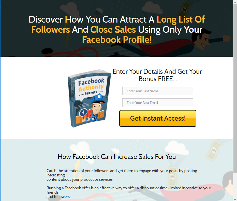
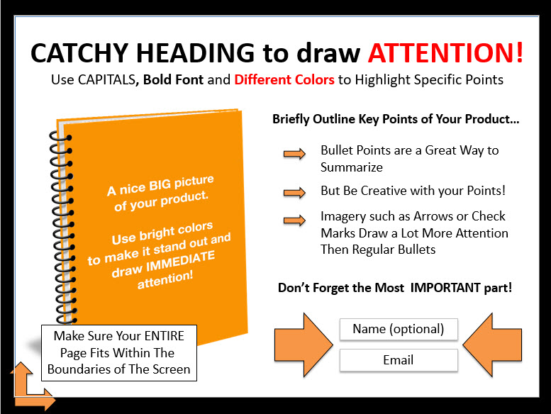
Hey! …need a new landing page? Get the template below:
A landing page is a webpage that you send people to when they respond to your advertising. It is where they initially ‘land’ when they click on your ad or some other external link.
There is a science behind good landing pages. And since the highest converting type of landing page is a 'squeeze' page, I've decided to give you a free template which can be edited and installed with just a few minutes of your time.
Download Landing Page Template below.

What is the difference between a Landing Page and a Squeeze page?
A squeeze page is a specialized landing page which is designed to maximize conversion rate.
Really, all pages should be designed to maximize conversions. But a squeeze page is different in that it has a very narrow focus regarding the kind of action you want your visitors to take. Typically this is a form that you want your visitors to fill out. But really, it could be any call to action (CTA).
For most businesses, making an immediate sale from a first-time visitor is unlikely. Some cultivation of the relationship will be necessary. This cultivation process requires that you have their contact details, so we will focus here on creating a great handshake page, in the squeeze style.
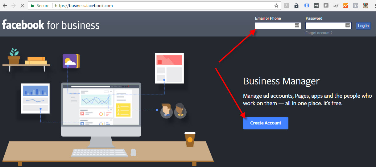
A squeeze page has limited navigation and no outgoing links. This reduction in navigation and outgoing links forces the user to either do what the marketer wants them to do, or abandon the page altogether. Thus, it is called a ‘squeeze’ page.
In the example below, Facebook gives only one viable option for non-members: Create Account.

One Sole Objective
Start by asking a simple question – What do you want visitors to your squeeze page to do? There should be one single action. Everything on your squeeze page should lead the visitor to this action.
Think of your squeeze page as a waterslide. It starts at the headline and leads the visitor shooting through the content to the opt-in form Once on the slide, there is no easy way off. If a squeeze page is well-made, your visitors will slide right through and take the action you wish them to take.
Deliver on Your Promise
Make sure that your squeeze page relates to your ad or link they clicked to get there. The ad or link makes a promise as to what the visitor is going to find when they click it. Your squeeze page should deliver on that promise. If a visitor clicks the link only to find something different than what they expected, they'll click away.
For example, if your ad says, 'Click here to get a 50% discount on the latest Dell PC,' but the squeeze page says, 'Welcome to Bill's Computer Store,' the visitor will leave. Instead, it should say something like, 'Are you ready for your 50% discount on the latest Dell PC? Get it here!' The message of the squeeze page and your ad need to be consistent. This is known as ‘ad scent’. If the scent on the ad matches what they see on your landing page, you’ll have higher conversions.
ABT - Always Be Testing...
Most marketers find that the fewer distractions there on the page, the higher the conversion rate is. But I have seen the odd case where a reduced menu also reduces conversion rate. This flies in the face of the belief that ‘fewer distractions is always better’. And I don’t want to confuse you. But I do want to point out that your conversion rate is fragile. Small things can make a difference. That is why your method must always be to test, never assume.

Get the Free Landing Page Template...
The download package includes:
1. HTML landing page
2. Images
3. CSS
4. Fonts
5. HTML confirmation page
6. Responsive design
This is the same template I give to my paid certification students. Get it free.
Use landing page template to kickstart your next landing page, or use it as a training and quality-control tool for staff.
Free Landing Page Template
Let me know where to send it:
![]() We value your privacy and would never spam you
We value your privacy and would never spam you
No Time to do it yourself? Get Help...
The students at MarketingEducation.org are available to help:
